Pretty and useful


Hi guys, kenarf here!
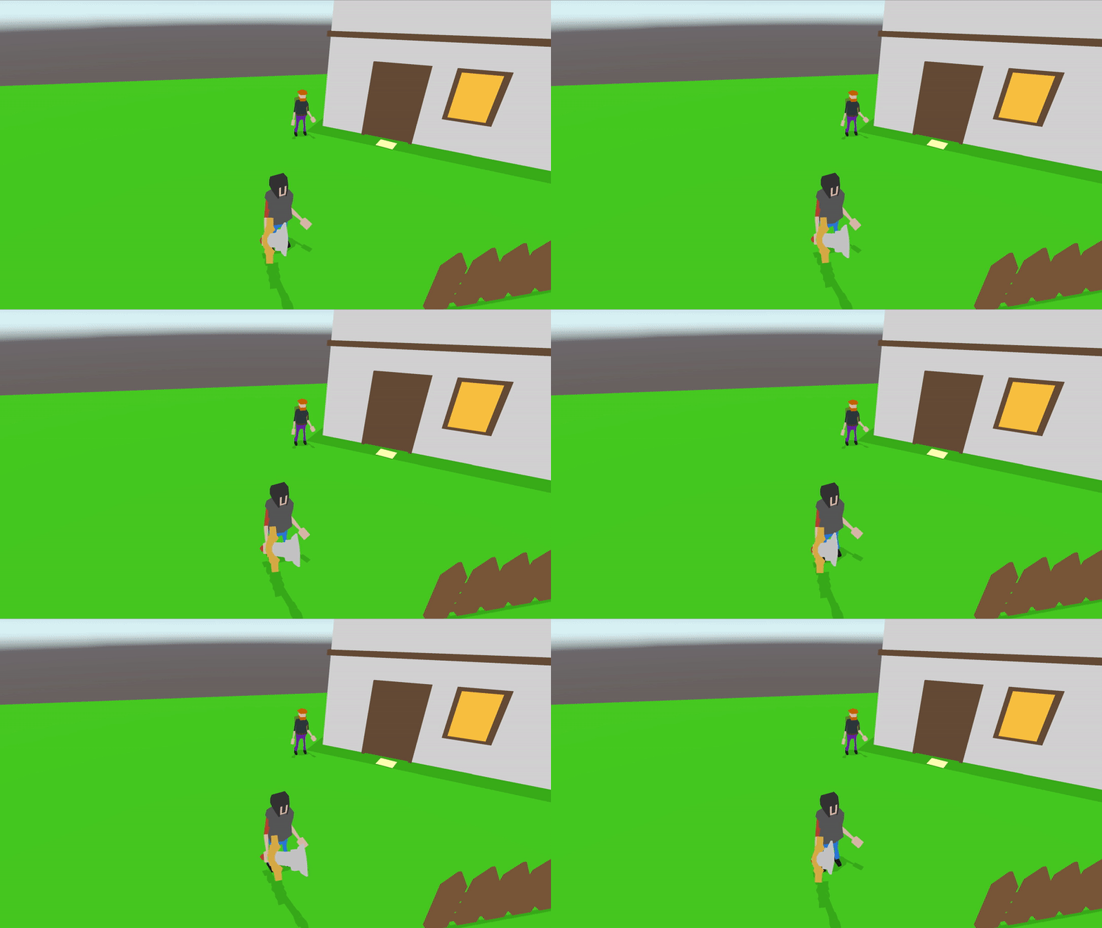
This week has been rich in visual changes in my game, as well as multiple design choices. Despite incoming mock final exams I managed to tweak the graphics a bit using a simple unlit shader with shadow caster property. In my opinion, the graphics look much better now and are much closer to what I wanted to achieve.
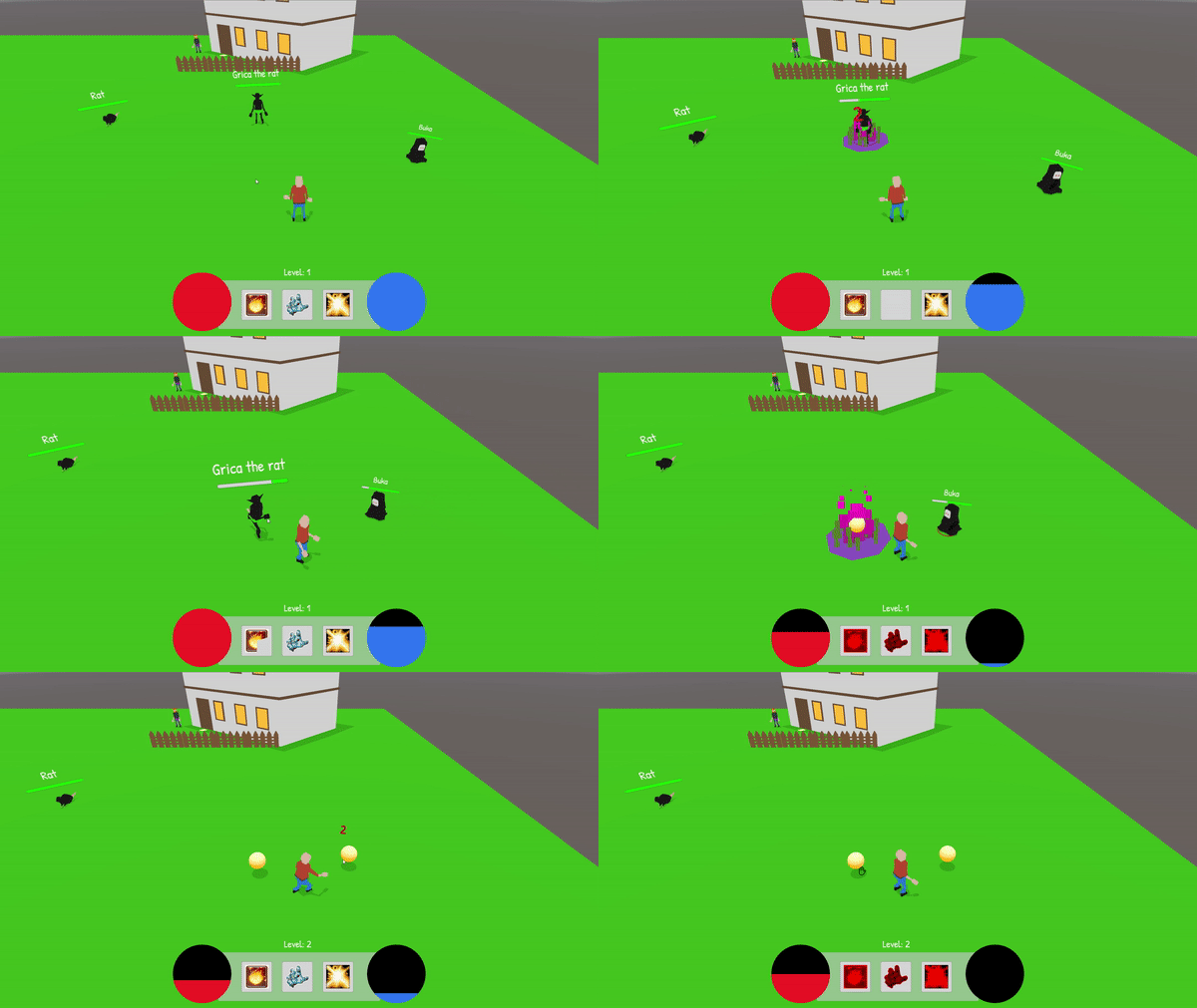
Another visual thing I added this week is this simple diablo-like UI you can see in the 2nd gif, I think it is a good foundation for further work on the game's UI and I am pleased with how the health and mana bars look.
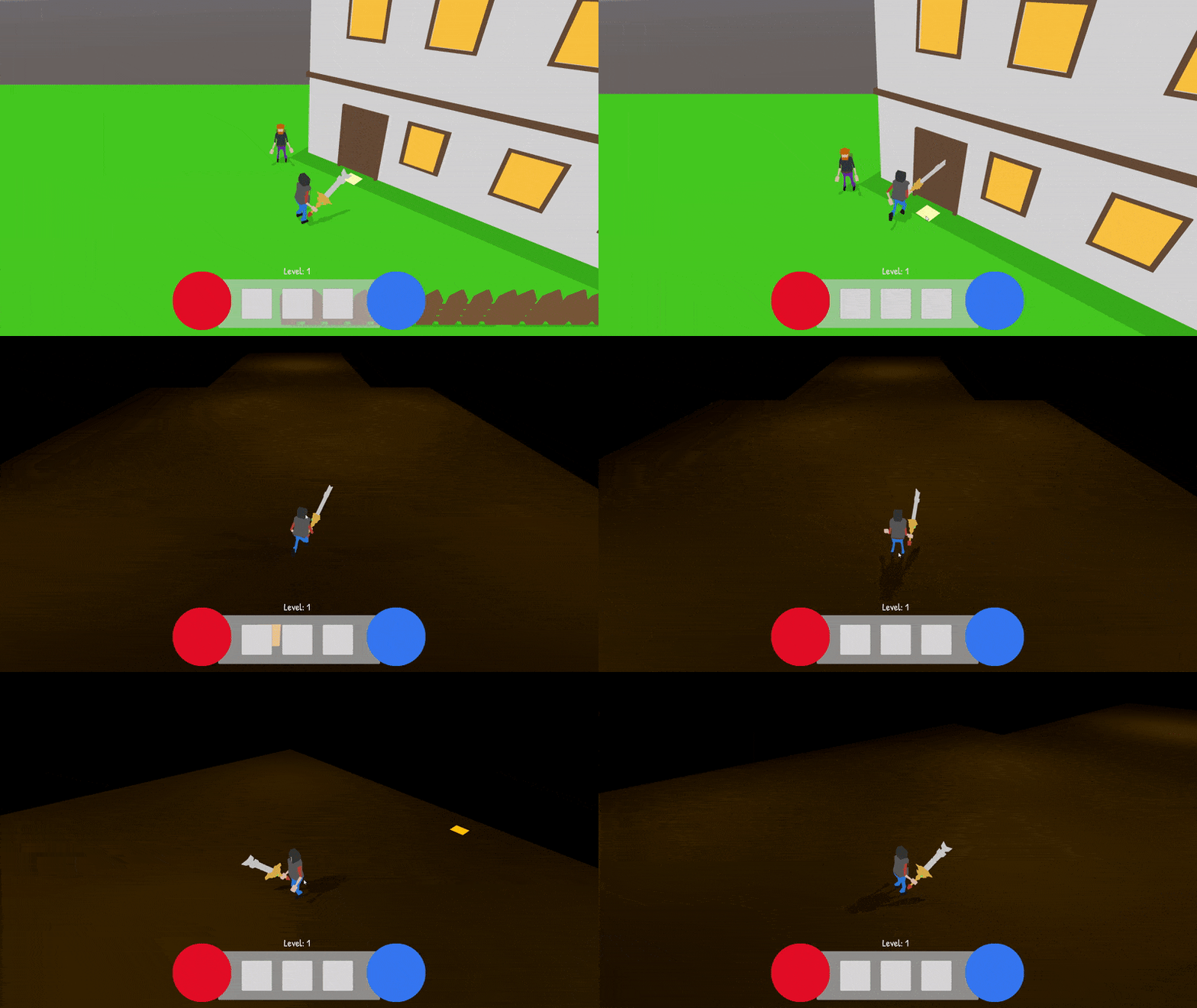
The last thing I worked the most on this week is a system of getting into the buildings, for now, it does not look like much, yet it may appear useful in the future. As a side effect of working on this system, I implemented a base of save system, which is going to be useful when I decide to build the game world and make it exciting
That's all for today guys, I hope this week will be full of both small and big successes, and that a huge smile will accompany your upcoming days!
Hack'n slash/RPG project (WORK SUSPENDED)
New project I've been working on lately
| Status | In development |
| Author | Kenarf |
| Genre | Adventure, Role Playing |
| Tags | 3D, Hack and Slash, Indie |
More posts
- Goblin mineMar 22, 2021
- TerrainMar 15, 2021
- Little tweaksMar 07, 2021
- Quests, usable items and moreFeb 22, 2021
- Equipment, shop and spellsFeb 15, 2021
- Screenshot saturday!Feb 13, 2021
- First post!Feb 08, 2021
Leave a comment
Log in with itch.io to leave a comment.